Business goals
GoldHand’s mission is to be the best, easy and quick method for users to find handymen who can solve their house or store problems. To create a huge community of handymen who would be partners with the company.
The company can potentially generate income by:
•Charging a one-time fee for downloading the app. (Optional)
•Charging a 20% over the works from every partners on the app.
•Offering further options to promote each partner and their service for an extra monthly payment.
•Charging a one-time fee for downloading the app. (Optional)
•Charging a 20% over the works from every partners on the app.
•Offering further options to promote each partner and their service for an extra monthly payment.
User goals
there are two type of users, the first one the householder or business owner who would require for a service. These users want to find quick availability to solve their problems with a trustful review system so they would know they will spend their money wisely.
The second users are the future partners, they want for a reliable method to promote themselves as well to find some quick income.
Three things that the user can do with the app are:
•Search on a catalog of services offered (painters, electricians, plumbers, roofers, house cleaners, gardeners, carpet installers, tile settlers, and AC technicians) based on specific filters such as: location, availability, reviews, ratings, etc.
•Create partnership account where users can offer their services to promote themselves and earn quick income.
•Upgrade partnership accounts to for extra options such as: getting on the top lists, promote their names, show offers, discounts, etc
Survey
In order to be accurate with my study I went to create an online survey in order to obtain extra information that could help on the construction of the app that can satisfied our users. 50 people decided to fully fill up and complete my survey
The results were the following:
1) Most common users possible would be women, since on the survey 70% of those who took it were women.
2) There is a big change most of my user could come from the big city or suburban, so it means no necessarily this is an app only for those on rural places with lack of services.
3) There is a good range of possibility that most of my users uses internet to research almost anything, including services.
4) For the user it was given 3 options between price cost, efficiency, and quality. From the survey most users look for efficiency but pretty much the 3 of them are almost at the same range of importance.
5) a good amount of people rely on companies when hiring for jobs, which means the app as being a main company that uses help from independent person will help them to gain those customers that relies on a big title, in this case “GoldHand” something interesting is that 50% answered that they didn’t care if independent from a company as long as the person do the job faster, so efficiency and speed is taking place again.
6) The survey shows that many people trust and rely on good high reviews, so it is assure that the usage of reviews that users can see will be very helpful and appealing for them.
7) There is a good percentage of people willing to hire independent people with good reviews, which assures that the partners will get the chance to be hired. There is a 30% of users that wouldn’t trust them if they are not form a company, but as highlighted before, our members will be under the name of “GoldHand”.
8) 70% of the persons on the survey decided that in case something went wrong with their work or service, they might want to place a complaint and ask for their money back, which means adding this on the app will guarantee a relief for users to see that they will get their money back in case something bad happen, as well adding option for placing complains, which would help to gather extra information from the users. As well something to take in mind of possible adding penalties for our partners when they have any lack of experience.
User cases & Competitive analysis
User cases:
1) Availability of services on new user’s area.
2) Earning trust on services and handymen for new customers.
3) Gathering of information for new customers before accepting or requesting the service.
Competitive Analysis:
1) Availability of services on new user’s area.
Competitor A: Handymen (beta)
Pros:
-It has pre-selected cities which shows the exact number of handymen in that area.
-You can schedule events on when you are going to need the service.
-Once the search is done, it will show a list of Handymen.
Pros:
-It has pre-selected cities which shows the exact number of handymen in that area.
-You can schedule events on when you are going to need the service.
-Once the search is done, it will show a list of Handymen.
Cons:
-The services are limited by just certain cities (only for India)
-The search engine is confusing, with only one button with a complicated look.
-There searching options are very limited without a GPS search option neither distance.
-The services are limited by just certain cities (only for India)
-The search engine is confusing, with only one button with a complicated look.
-There searching options are very limited without a GPS search option neither distance.
Competitor B: HomeAdvisor
Pros:
-It has a search bear for quick searching with keywords
-It makes a search by zip code
-It has a searching options step by step.
Pros:
-It has a search bear for quick searching with keywords
-It makes a search by zip code
-It has a searching options step by step.
Cons:
-It takes a bit of time to find the right search option.
-It doesn’t let you move forward nor go back to make changes.
-It does not show who is available at the moment if the service is needed it immediately.
-It takes a bit of time to find the right search option.
-It doesn’t let you move forward nor go back to make changes.
-It does not show who is available at the moment if the service is needed it immediately.
Competitor C: TaskRabbit
Pros:
-It has an address search engine with quick guessing.
-It shows some profiles from the area.
-(none)
Pros:
-It has an address search engine with quick guessing.
-It shows some profiles from the area.
-(none)
Cons:
-They are in the USA but only on certain cities (10 total)
-It does not show availability.
-It does not show distance before requesting the service.
-They are in the USA but only on certain cities (10 total)
-It does not show availability.
-It does not show distance before requesting the service.
2) Earning trust on services and handymen for new customers
Competitor A: Handymen (beta)
Pros:
-It has ratings per handymen.
-There is a client comment list.
-There is an option to call the handymen before requesting the service.
Pros:
-It has ratings per handymen.
-There is a client comment list.
-There is an option to call the handymen before requesting the service.
Cons:
-It does not show a good rating list that describes it.
-There is not a function to place reports or complain.
-There are not many recent updates.
-It does not show a good rating list that describes it.
-There is not a function to place reports or complain.
-There are not many recent updates.
Competitor B: HomeAdvisor
Pros:
-It has a basic rating option.
-It has a comment section to see how previous customers has rated that profile.
-You can call the handymen.
Pros:
-It has a basic rating option.
-It has a comment section to see how previous customers has rated that profile.
-You can call the handymen.
Cons:
-There is not an option to place complains or ask for questions.
-The rating review it only shows as overall but there is no rating for different qualities.
-There is very few information about the handyman with only a bio and services offered.
-There is not an option to place complains or ask for questions.
-The rating review it only shows as overall but there is no rating for different qualities.
-There is very few information about the handyman with only a bio and services offered.
Competitor C: TaskRabbit
Pros:
-It has a thumb up option.
-Smalls comments sections
-It shows prices per hour for basic works.
Pros:
-It has a thumb up option.
-Smalls comments sections
-It shows prices per hour for basic works.
Cons:
-There is lack of profile information.
-There is no extra options to reach the handymen neither the company.
-The review rating lacks on specifications.
-There is lack of profile information.
-There is no extra options to reach the handymen neither the company.
-The review rating lacks on specifications.
3) Gathering of information for new customers before accepting or requesting the service.
Competitor A: Handymen (beta)
Pros:
-You can contact each handymen by phone calls.
-There is somewhat of info and a profile image.
-It shows payment options.
Pros:
-You can contact each handymen by phone calls.
-There is somewhat of info and a profile image.
-It shows payment options.
Cons:
-There is no a customer service button to request help.
-The profiles of each handymen contains very short non detailed information.
-You can not leave a message to either request an estimate nor ask questions.
-There is no a customer service button to request help.
-The profiles of each handymen contains very short non detailed information.
-You can not leave a message to either request an estimate nor ask questions.
Competitor B: HomeAdvisor
Pros:
-There is a side bar menu with an about panel to send feedback
-You can request for quotes before asking for the service.
-They have a bio but is located at the bottom of the comments which it makes it hard to find.
Pros:
-There is a side bar menu with an about panel to send feedback
-You can request for quotes before asking for the service.
-They have a bio but is located at the bottom of the comments which it makes it hard to find.
Cons:
-There is no a help or customer service button.
-The profiles lack with tons of information that could be required as well availability.
-The only option to reach the handyman is by phone without the option for private calls.
-There is no a help or customer service button.
-The profiles lack with tons of information that could be required as well availability.
-The only option to reach the handyman is by phone without the option for private calls.
Competitor C: TaskRabbit
Pros:
-It displays some basic prices per hour
-It is missing a lot of details.
-There are no many pros about information. but the app gather more information that it should.
Pros:
-It displays some basic prices per hour
-It is missing a lot of details.
-There are no many pros about information. but the app gather more information that it should.
Cons:
-There is no enough information on profile neither phone number to reach the handyman.
-The home is totally confusing without a simple search engine.
-It does not gives quotes or estimates.
-There is no enough information on profile neither phone number to reach the handyman.
-The home is totally confusing without a simple search engine.
-It does not gives quotes or estimates.
Personas
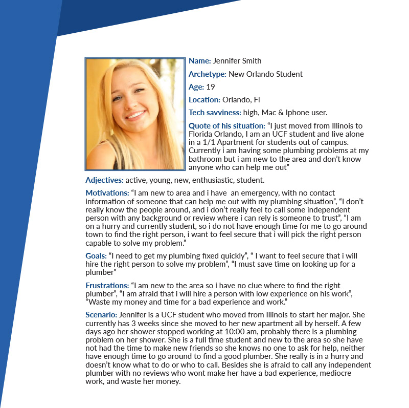
thanks to the data gathered from the previous survey, the following persona were developed. Designing for these personas helped in making user path and informed design decisions as I had the end user always in mind.


User journey
by having my personas in mind and their needs I proceed on the creation of a user journey. This is focused mostly on the user searching for a service.
Process flow
I also created a process flow of the key task from the app: Account creation, Search, Sorting, and Booking. By going through the flow of the key tasks it helped us think through the core activities and ensure a seamless process from all perspectives (planner, guests, restaurant) in the dining out experience.
Site map
After considering the user journey and the process flow I moved on the construction of a site map to organize the pages, information, and navigation of the app.
Sketches
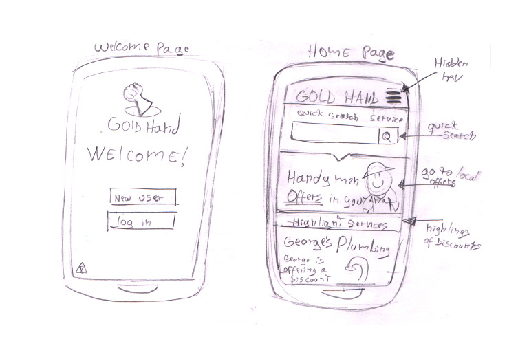
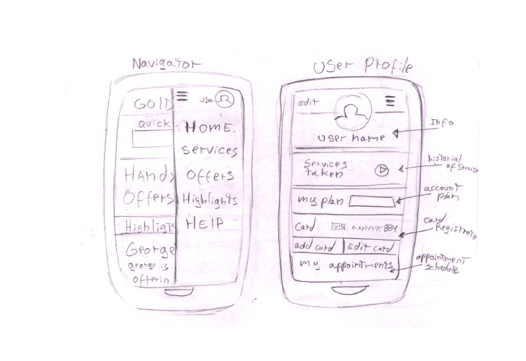
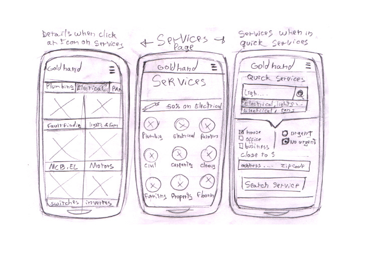
Some sketches on which I was considering on a proposal of the look of the app considering the information arrangement on my site map as well thinking on my user process flow.

Wireframes
A progression of key screens of high fidelity wireframes.
These iterations were based on the user need and process flow.
These iterations were based on the user need and process flow.

Accessing Process
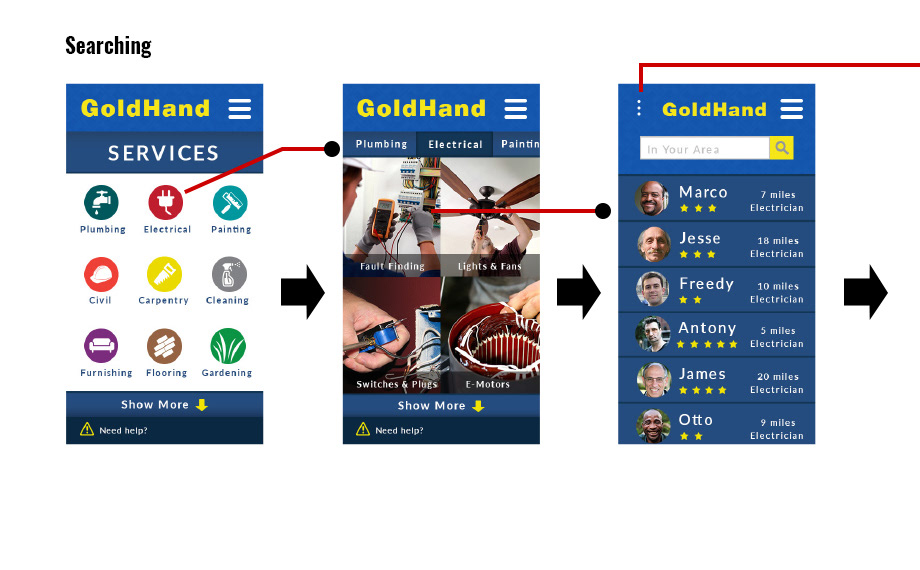
Searching Process
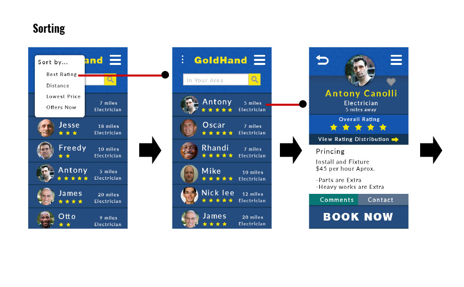
Sorting Process
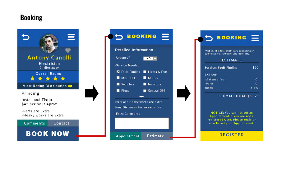
Booking Process
User testing
I tested my wireframes against key tasks with a prototype. This helped me identify user
frustrations we needed to address so I could improve my designs. Here is some feedback and observations received from user testing:
frustrations we needed to address so I could improve my designs. Here is some feedback and observations received from user testing:
Tasks:
1) Guess what can you find or do on the homepage.
2) Search for a handy man with the best ratings and near your location.
3) Ask for an estimate.
Results:
Task 1
Most of the users tested got a good first impression from the app. 3 out of my 5 users got a slam confusion on what was the difference between the highlights and the Offers. After a short explanation, they felt that it made sense and probably they would have understood it if the link was available to be seen.
Most of the users tested got a good first impression from the app. 3 out of my 5 users got a slam confusion on what was the difference between the highlights and the Offers. After a short explanation, they felt that it made sense and probably they would have understood it if the link was available to be seen.
Task 2
At first all of my users wanted to go straight to the search bar, but again i had to told them that it was disabled. 2 out of my 5 tried to click the link of the offers. At the end all of the users got to use the burger nav and find the link to the services. From this i came to the conclusion that maybe adding a button of the services in the homepage would be a good idea. After they opened the services they actually went straight to the fault finding without any problems. Some of the users wanted to even view the other services.
At first all of my users wanted to go straight to the search bar, but again i had to told them that it was disabled. 2 out of my 5 tried to click the link of the offers. At the end all of the users got to use the burger nav and find the link to the services. From this i came to the conclusion that maybe adding a button of the services in the homepage would be a good idea. After they opened the services they actually went straight to the fault finding without any problems. Some of the users wanted to even view the other services.
Task 3
2 out of my 5 users got a bit lost to find the estimate of the service but after clicking the book button they found the estimate pretty quickly. Maybe moving the interface out of the book section or adding a second one could be necessary.
2 out of my 5 users got a bit lost to find the estimate of the service but after clicking the book button they found the estimate pretty quickly. Maybe moving the interface out of the book section or adding a second one could be necessary.
Key learnings
• Next Steps: Changes on the interfaces and designs according to the info obtain on my user testing, to move to a second user testing. after all changes are complete, move to the development of the app.
• Since this was a personal project, I lacked communication with a developer at the beginning of the project phase to really understand the integration of the application with current POS systems. This taught me the importance of working with developers at the beginning of a product cycle to fully understand the technology you are building for.
