web Project goal
After creating a new brand identity graphically, the business was requiring for an update on their website to match their new identity. the goal of this would be to help their costumers that these days are mot tech savvy to obtain information about the business easily accessible and fitting for their hipster vibe. also they owners wanted to start with some new reward system for their customers.
the problem
The first problem i went into was that their previous website was very outdated. Lacking several other pages and important information such the menu. This was not only a redesign project but a whole design thinking to recreate a complete website that could include all the essential materials needed but as well sticking with the new brand identity.
the solution
I would have to go for a whole study to recreate a new website fitting for the business and appealing while user friendly for the customers. working with the business owner to gather as much information possible while also getting inspiration from other places with similar cites to make sure I was not missing any content. adding a new reward system on which customer would obtain points per sales to later exchange for discounts or products after accumulating certain amount.
my roles
information architecture, planner, user path design, wire framing, web designing.
Defining Content & Information Architecture
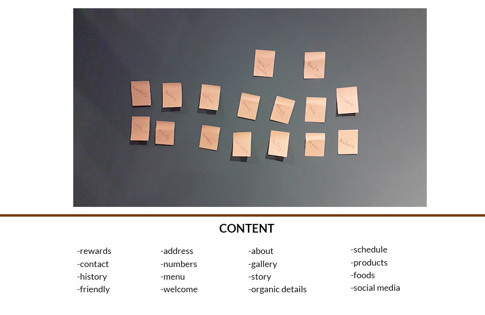
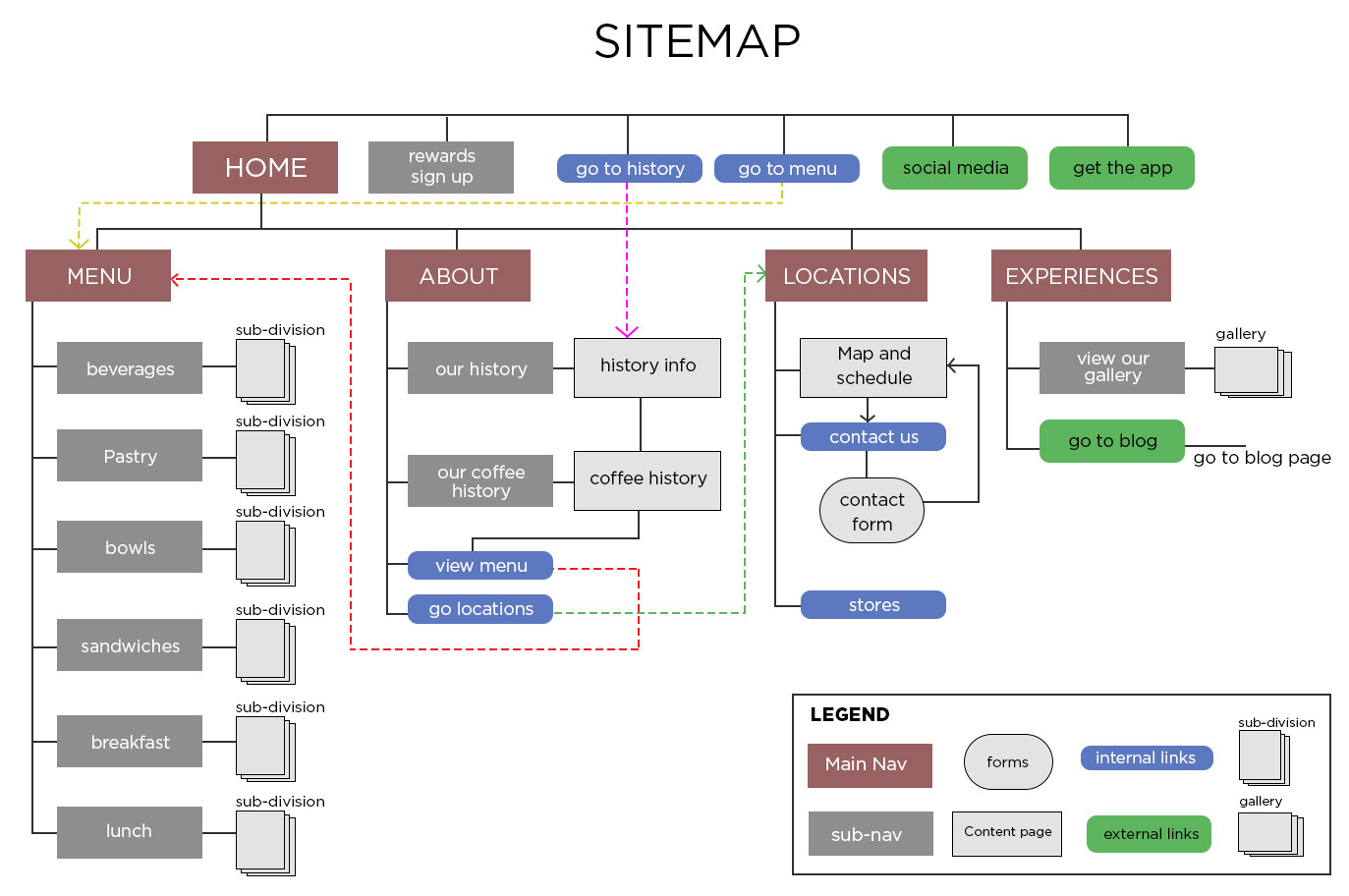
By gathering information from the owners I was then able to narrow down some content material via card sorting for the necessary to help me on the construction of a site map to organize the pages, information, and navigation.

FINAL WEB COMPS
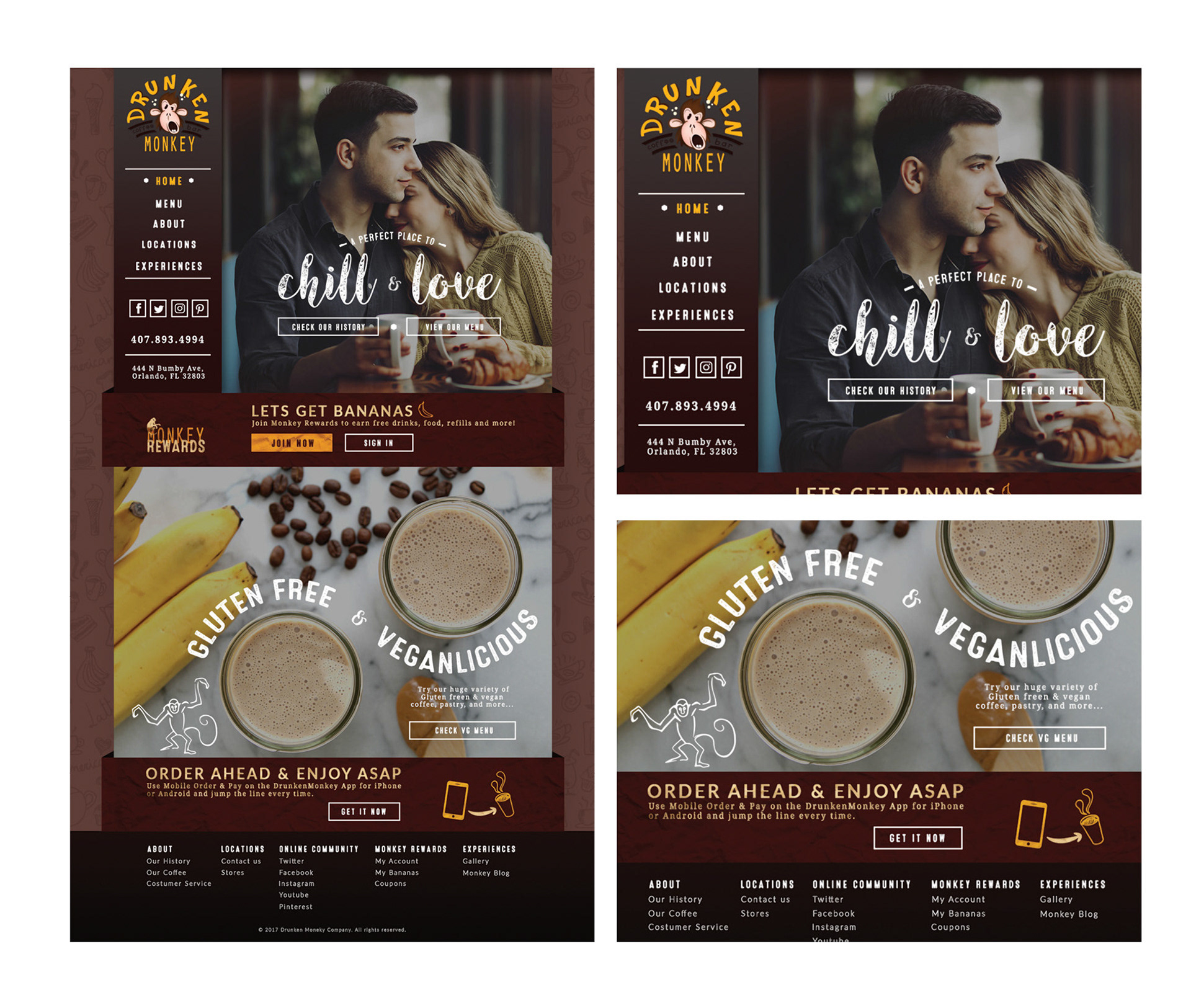
Home page
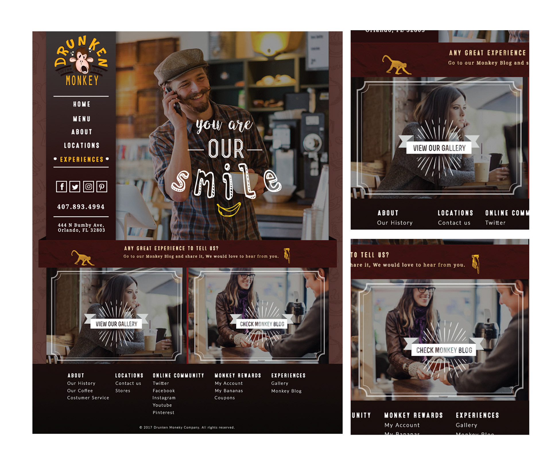
Experiences page
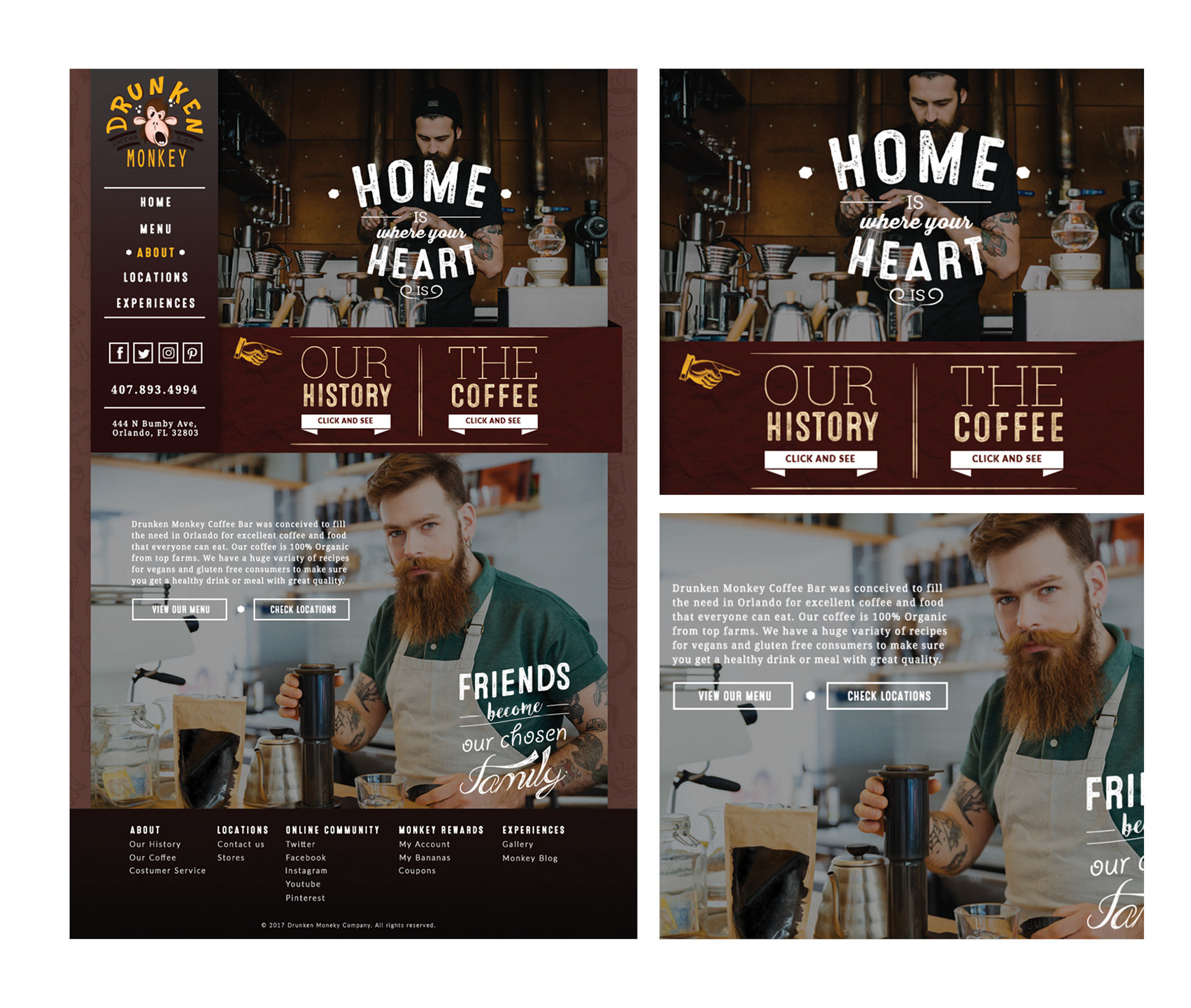
About page
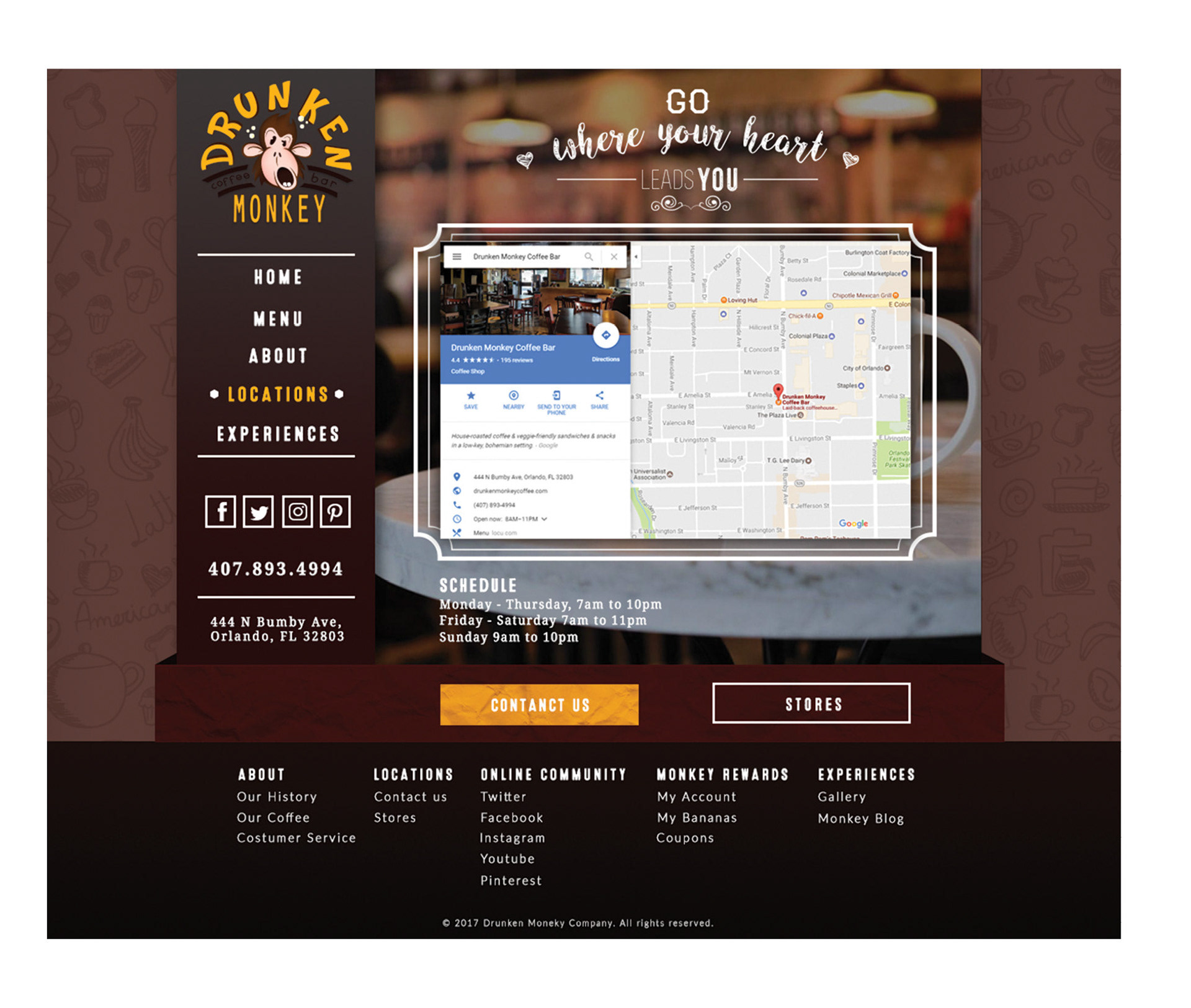
Locations page
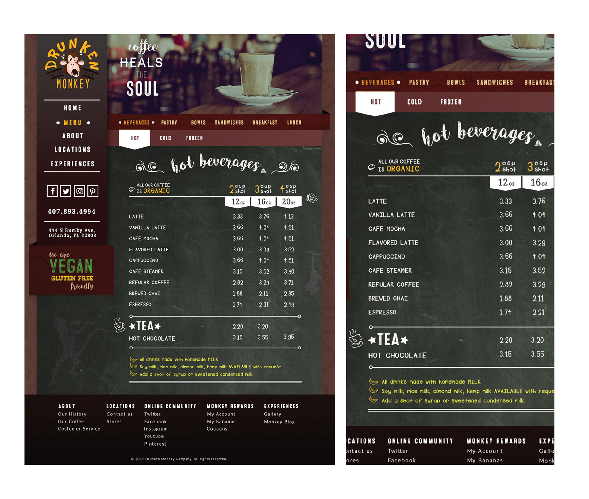
Menu page
APP SIDE PROJECT idea
While on the creation of the website, an app idea was born. I thought what if there were an app on which would allow users to prepare and modify orders to pick up or to sit down there. so in this way customer who does not want to wait for the preparation time they could arrive to the place with their food ready to dig in. As well giving the user the option to pay at the moment or at the bar.
business goal
since this was a personal project idea, I created a fictional business goal in order for me to carry on the full process and to have something to keep in mind. The main goal it would be motivate customers to get more orders by simplifying some live steps. This app could help to also give extra visibility to the brand and attract new possible customers.
USER goal
The user goals would be to save up time by pre-ordering food without waiting on lines or for food to be prepared, easy payment, and obtain rewards or points by each order.
tools used
AdobeXD (comp creation and prototyping), Illustrator (vector interfaces and illustrations), Photoshop (image control, polishing, mockups)
survey
Before even diving into the features and the overall UX of the app, I firstly gathered extra data thru interviews done to the customers at the coffee. this helped me get a better understanding of human mentality when ordering and how to help them improve their experience. These are some the key take away from those interviews:
First to take notice, most of my interviewees were college and university students, and some few locals with stable jobs.
1) Most of the interviewers complaint about the time delay when ordering, plus the drive time because the shop was not easily accessible.
2) when asked what was one of the most important part of ordering multiple order, many point out the fact of being specific with their orders. Meaning a great importance on customization of their orders.
3) when I asked about a possible app on which they could pre-order all of them showed big interest, but moving to the question what would they wish to know when making their orders, they all answered the time for them to arrive and plan their schedule or if they could set up and specific time for pick ups.
persona
Based on the research found on my discovery period of the project a persona was developed, Sarah. Designing for Sarah helped in making informed design decisions as I had the end user always in mind.
user journey
Keeping Sarah in mind, I mapped her user journey from planning to obtain her pick up order. Understanding her decision making and flow within the pick up ordering experience allowed me to brainstorm the necessary features and opportunities required for Sarah to successfully navigate through the app thru a process flow.
process flow
Considering my user journey I moved on the creation of a users process flow on the main task of ordering something from the menu, customizing it and setting it up for pick up at certain time.
In this following diagram shows the steps a new user would take from register up to getting a cappuccino to pick up:
information architecture
I moved forward to the construction of a site map to organize the pages, information, navigation and the inclusion of the option for users to add the items from the menu to customize. There was just a new addition of the new content such: Wallet, Rewards, and Account as well the final section of item description and cart.
PHONE APP ASPECTS
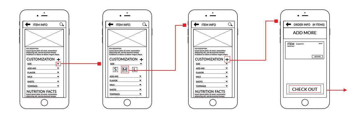
WIREFRAMES
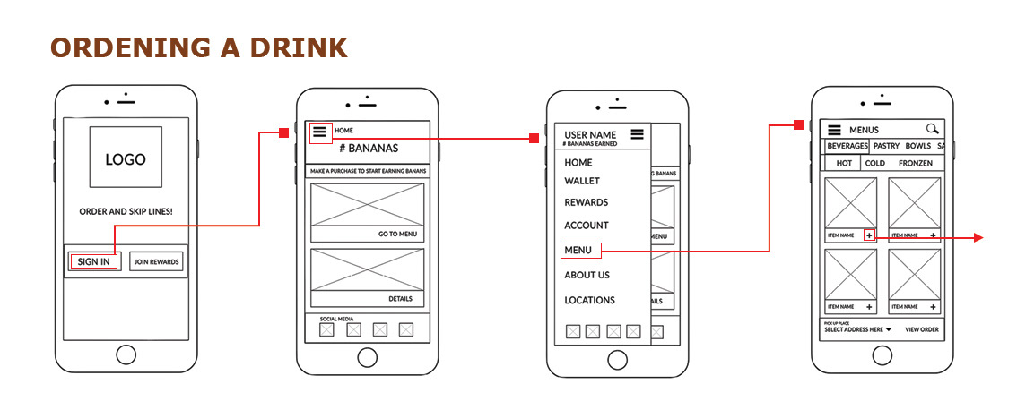

user testing
I decided to pick some users from the coffee shop, on which 5 were willing to take the test. On the following are the tasks given and its results:
User testing tasks
1) Search for one item on the menu and read its description.
2) Customize the item and add to the order.
3) Check out the order, by choosing the nearest place for pick up, and complete the process.
User results
Task 1
All test users were quick to access to the main menu, browse thru the nav to find the Menu section and pick the first item on which they could easily read its description.
Task 2
For all my test users were easily able to customize the size of the item of the order, but all had a problem on adding the item to the cart dude to the interface was not clear for them.
Task 3
Once all users were explain the option to add the item to the cart they all felt the following task was very straight forward. They all easily went to the check out area, picking the nearest location, and chose the option to be a pick up and proceed to pay. Some interesting feedback from the users was that 3 of them mentioned that it would be more convenient to first pick the option of pick up and after choosing the place.
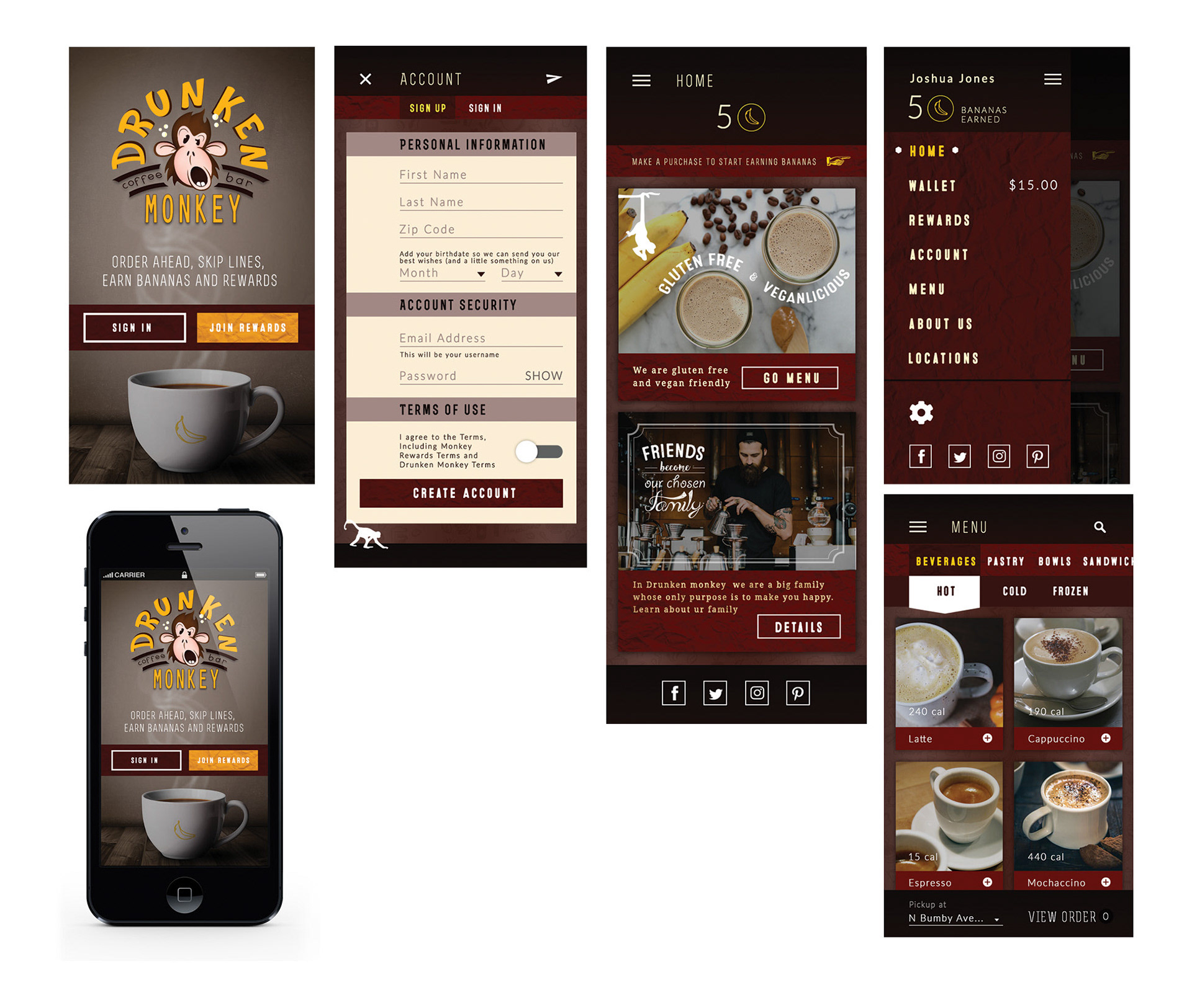
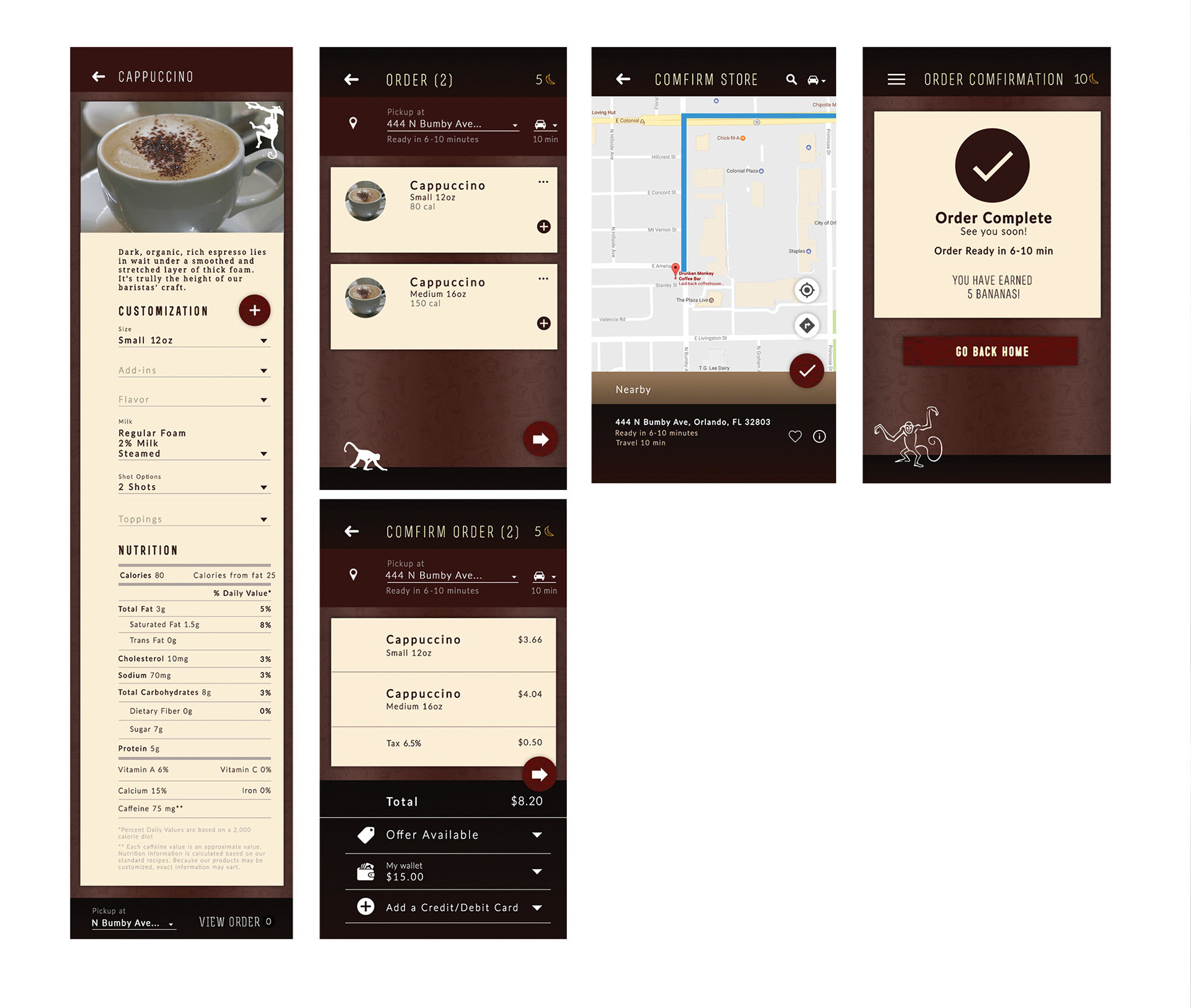
Thanks to my results on this test I was able to do some minor changes and went again on some quick prototyping on which lead to much positive response. After this I moved on the graphic and visual creation of the interfaces and overall look of the app thru some comps.
FINAL COMPS
What's next?
If this app would become into reality, my next step would be getting together with a developer in order to reconsider the whole UX & UI study in order to pin point possible technology problems, most likely we would reconsider some few changes for a final user test and move forward to development and delivery of the final product
